Monday, July 20, 2009

I Once Owned Ottawa’s Worst Bathroom

metamorphosis

                                                                               Thanks to Susan at Between Naps on the Porch for hosting Metamorphosis Monday!


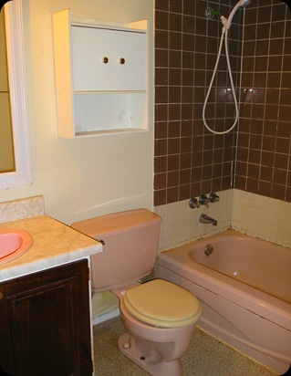
Really, I did.  Hideous, mildewy, disgusting, pink.  Need I say more?  Since a picture is worth a thousand words, I’ll just show you.

Kidder bathroom BEFORE 003 

That’s not even the worst.  The next one is:

Kidder bathroom BEFORE 001

I can hardly stand to look at it.  The bathroom was mostly original to the house, built in 1973 (the Pepto-Bismal coloured sink was replaced later, since it didn’t match the tub and toilet).  We had a leaky roof and pretty substantial water damage to the ceilings in the bathroom and our bedroom, so mold was becoming an issue.  I remember at one point watching a stream of water pour out the bottom of the light switch plate. 

Anyway,  we saved our pennies and gutted it last October (I know, I’ve only finished/styled it now!).  Everything went – from the ceiling, to all the drywall, to the subfloor.  Here’s a picture:

Kidder bathroom BEFORE 004 

We found something interesting under the tub when it was ripped out.  It wasn’t treasure, unfortunately, but it was funny and I’m keeping it as a souvenir.

stubbybeerbottle


So someone was drinking on the job while building my house.

That sure explains a lot!


After 5 days of noise, mess and a nap-less baby, here is the finished bathroom:

bathroom after (2) 

The door opens into the bathroom against the towel wall, so I took the door off the hinges to get this shot.  You gotta do what you gotta do, right?

bathroom after 3

So much better!  It’s clean, fresh and pretty!  And, believe it or not, the whole renovation cost only $7000.00!  I really wanted a budget friendly makeover, so I chose inexpensive tiles for the floor and shower.  Laying the tiles in a brick-joint pattern creates visual interest for standard 8”x12” tiles.tiles

I had hoped to add a border of glass mosaic tiles, but it wasn’t in the budget and I couldn’t find the right colour combo.  Don’t you hate when you have something in your head but can’t find it?

A laminate countertop in cream with white and blue specks is fresh and neutral.  White cabinets and fixtures are clean and simple, and if something needs to be replaced in the future there’s no worry about mismatched colours (ie. the Pepto-Bismal pink sink).

spidermums 

I made the artwork myself with a $20.00 pack of canvasses from Wallack’s and some leftover paint from my main floor. I mixed the paints in various ratios to achieve a gradation of colour for the backgrounds.  Then I went online and found some flower silhouettes that I printed out, X-acto’d, and painted with more leftover paint and some shimmery mother-of-pearl paint (that’s why the pic in the bottom left corner doesn’t show up too well – the paint is only semi-opaque).

bathroomart

My only real issue is that I didn’t specify to the guys doing the work that I wanted the shower curtain rod a little further out (more even with the edge of the tub) and a little lower – though in a bathroom, the “flood pants” look might be more suitable!  They caulked around the edge of the rod so I can’t move it.  Well, I guess I could, but it’s so neatly done that I don’t want to wreck it.  So it stays.

The bedroom makeover continues.  I’ve got the walls all painted and the colour looks great!  The drapery panels and rod are back up, but one of the roman shades has to be replaced (the clips holding it onto the track broke).  I’ll update as I go!

Sarah

Monday, June 29, 2009

The Bedroom Makeover has Officially Begun!


Butterfly


Thanks to Susan at Between Naps on the Porch for hosting Metamorphosis Mondays!

And so it began with the most important element of the transformation (at least according to my husband) – the installation of the 32” flat screen TV!

We did it ourselves this morning, which was an interesting adventure, as he and I do not work well together when it comes to home repair (though we do play well together!).

P1010728 Here is the mounting thingy.

P1010732And here is the TV mounted! 

The cords aren’t great, but there’s not a whole lot I can do about them.  Maybe I can find some nice, big (and pretty!) accessories to help disguise them a little.

P1010736

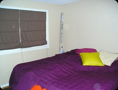
Here is our very neglected bedroom.

You can see the beginnings of the colour palette – purple, pink, acid green and brown.  Don’t mind the messy bed, this is a before picture, after all!  The walls in the above pictures are the new wall colour, an original I created at Randall’s one slow afternoon.  Of course I had to hurry up and paint the TV wall so we could get it up!  The rest of the painting will hopefully be finished tomorrow.  I’ll keep updating as I go along!

Pssst!  Look at the orbs!  Does anyone else think they’re more than dust motes?

Wednesday, June 17, 2009

Beautiful, Historic Niagara-on-the-Lake

Two weeks ago I returned from a family vacation to Niagara Falls. I had hoped to be inspired while there (I’ve had “blog-block”), and I wasn’t disappointed! We went on a day trip to Niagara-on-the-Lake, a quaint little town about 45 minutes from downtown N.F.

157Here’s my daughter, Ava, playing with her toes on the car ride to Niagara-on-the-Lake.

The drive to NOTL is just as beautiful, if you’re lucky enough to be a passenger and not the driver, winding roads with the water on one side and gorgeous B&Bs and carefully maintained old homes on the other. I tried to take pictures as we were driving, but it didn’t work.

I found a few beauties on MLS:

MLS® 20107616

This one is 150 years old!

The main street was full of cute little shops, most with beautiful architecture and lots of charm.166 I took this shot because I loved the windows…so pretty!

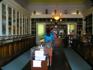
We came across an old apothocary which has been converted into a museum. According to their website (which is SO interesting!):

The Niagara Apothecary
is an authentic museum restoration of a 1869 pharmacy as part of a practice that operated in Niagara-on-the-Lake, Ontario, from 1820 to 1964.

158 161

Beautiful black walnut and butternut fixtures.

159

Faithful restoration of the original gaslights.

160

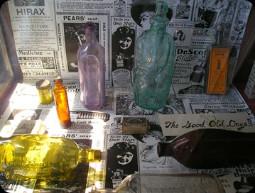
The Leech Jar - This 19th century white glazed china leech container is the hands-down favourite among the Niagara Apothecary artifacts. It is about 0.5 m (20 inches) tall with a perforated lid to assure a suitable degree of ventilation for the leeches. Leeches were sold to facilitate blood letting therapies now largely outmoded. www.niagaraapothocary.ca

www.niagaraapothocary.ca

162

163

Lovely mouldings.

164

165 The Prince of Wales Hotel

You can’t tell from this picture, but this is one loooong hotel! I don’t even know how many blocks it stretched! Check out this link for an idea of it’s size : http://www.niagaraonthelake.com/gallery/displayimage.php?album=8&pos=12#

Unfortunately we didn’t go inside (too busy shopping!), but had I known what was in there, I would have made more of an effort.

On the Vintage Hotels website, there’s a brief history of the hotel and all it’s Victorian splendour.

All in all, we had a great trip and I think my “blog-block” is mostly resolved. Maybe I just needed a vacation!

Thanks for listening!

Sarah

Saturday, June 13, 2009

OSEB

So it's been a while since I've written anything really susbstantial, but I do have an excuse! You may remember back in April I was applying for the Ontario Self-Employment Benefits Program, which is a government funded program to help people become self employed, through financial assistance and business training.

Good news! I was accepted and it's been a crazy couple of weeks. I actually missed the whole first week of seminars (I was having a grand ole time in Niagara Falls with my family - a related post to follow shortly!) so I've been catching up on them in addition to the regularly scheduled courses this past week. After being home with my daughter for the last 16.5 months, being in class all day is a bit of an adjustment!

The courses are great - marketing, taxation, business plan, time management, financial templates, etc. to name a few. While the material is a little dry in some cases, the information is invaluable for a new entrepreneur! What a great opportunity!

Anyway, I just wanted to let you all know where I've been hiding the last few weeks, and I'll try to update more regularly!

Thanks for your patience!

Friday, May 15, 2009

Hooked on Yellow!

A strange thing has happened...my least liked colour is my current favourite! I still don't love it on walls, but have come around to it's sunniness in fabrics, accessories and art. I especially love yellow paired with green, pink, orange, white and teal, either separately or all together!


A cool lighting fixture, but a little creepy too?


Reminds me of pink lemonade!


A little too much yellow for my tastes, but pretty all the same!


Friday, May 8, 2009

Hooked on Damask!

This is my first Hooked on Fridays post, but not my last, as I'm hooked on tons of things!
I LOVE damask! Right now it's a super hot pattern and I can't get enough! I love how bold and graphic it is, how traditional, yet modern and how colourful and funky it can be!


Strange, though, I say how much I love it, but don't have it anywhere in my house! Maybe I'll use it as an accent wall in my bedroom...though I've changed my mind so many times, the room will probably stay the same for at least another year!

Too pretty to eat!

Super cute Tommy Bahama swimsuit. Too bad my bikini days are long gone...

Wednesday, May 6, 2009

Design Heart Throbs in Ottawa

I wonder who likes Colin and Justin more? Gay men or straight women? If last Sunday's turn out at the Women's Show is any indication, I'd say the girls win. And C & J know how to play it up!
I attended their second on-stage appearance of the day, grabbing my seat close to the front early (the better to see up their kilts, of course!). Ok, not really with the kilts - I didn't need to sneak a peek - Justin came out and immediately twirled, giving us a free show. And they matched his purple ensemble....but enough about what's under the kilt...I am a married woman, after all!

Colin and his signature gigantic boutonniere!
Though the show was supposed to be about design trends, C & J spent a good part of the hour bantering with the audience, teasing the few men in attendance and mocking (in good fun) other design superstars, like Debbie Travis (who I've met twice, but that's another story). When they finally got to their slideshow it was really a before and after of some of Canada's worst homes. Well, worst homes until C & J got to them. Some were pretty stunning.

Colin with his eyes closed. I somehow catch people like this quite often.
After the show C & J signed my copy of their new book Colin & Justin's Home Heist Style Guide and took a picture with me.

Did you know they posed for Harlequin Romance covers?? Sorry the pics are so small!
Colin is quite believable as an ancient Scot...obviously!
Apparently Justin's bleached hair was better suited for a modern officer of the law.