Wednesday, April 29, 2009

What's All the Fuss About VOCs?

What are VOCs? VOC is an acronym for Volatile Organic Compound. VOCs refer to chemical compounds that tend to vaporize into the atmoshere. While not everyone is affected by this off-gassing, many people are very sensitive and can become quite ill.

www.uweb.ucsb.edu
According to the EPA (Environmental Protection Agency), interior latex flat coatings must have a VOC level under 5 grams per litre to be considered Zero-VOC. IMHO, zero means zero. I'm not however, suggesting that a 100% Zero-VOC paint is a good idea. In fact, the VOCs in the paint help the paint to perform better. Certain VOCs give paint more open time. This means the paint dries slower; while impatient painters won't like the idea of a slow drying paint, it's a good thing as it self-levels, eliminating roller and brush marks.

Low-VOC paints must have a VOC level under 50g/l. Again, this is for flat latex paints. The higher the sheen, the higher the VOCs.

Another big misconception is that when you buy a "no-" or low-VOC paint, that's what you're taking home. That would be true if you took the can off the shelf and started to paint. While the base can be "no-" or low-VOC, the tints or colorants are not. Tints can more than double the VOC level. A lighter colour will have less VOCs than a darker colour.

There are two dominant testing methods for VOCs in paint. Test Method 24 was once the most popular method, but is no longer considered as accurate at low levels (not registering any VOCs or levels that are too high). Test method D6886 is now considered the more accurate test.

I personally recommend C2 paint for all my clients and indoor products. Their new LOVO line was created to surpass their premium line in quality and eco-friendliness. Low odour, great coverage and gorgeous colours (though it can also be tinted to match any paint brand or custom colour) are just a few of the pros C2 offers. All their bases also test at 25-40 g/l making them a smart choice for a low-VOC paint.

"C2 doesn't want to go green just for the sake of going green, but only if it also makes the product better."

Lee Martin, General Manager of Randall's Paints and Executive Board Member of C2 Paints.

www.collegeprochicago.com
Here are a few good websites if you want more info on VOCs:

Remodeling Recon Blog

Austin Energy

Consumer Reports

Randall's Paints

Northwest Renovation

Tuesday, April 28, 2009

Great Deals at Fabricland!

There's nothing I love more than a great find...except a great find at a low price! I'm a big believer in spending money wisely and finding budget friendly solutions to home decor problems.

My favourite store right now is Fabricland. I usually hit the one in Kanata on Hazeldean since I'm in Bell's Corners, but the one on Merivale is full of interesting fabrics and accessories too. They actually had quite a few more cushion covers than the Kanata store the last time I was there. And if you're a Sewing Club Member you get all sorts of discounts, usually in the 40% - 50% off range.
Here are a few of the great finds I've come across:
A pretty pink and green scheme for my baby girl. I didn't want a baby pink cutesy room that was too precious, but being my only daughter (and ally in a house full of testosterone!) I had to have some pink. I also wanted a room that would last her a few years. Paired with creamy walls and off white furniture, the colours pop in this fresh and pretty scheme.
Pink, cream and green checked fabric - reg. $21.95/mt
Pink tweed - reg. $14.95/mt
Botanical - reg. $16.95/mt
Trim - reg. $7.95/mt
All 40% off at time of purchase
This is my main floor colour scheme. Sophisticated blue-gray and brown are accented by a brighter blue and a few green accessories (like the dog bed, which I didn't include a picture of).
Drapes - ready made - reg. $24.95 for 2 panels
Large scale floral - reg. $21.95/mt
Small scale floral - reg. $16.95/mt
Blue circles cushion cover - $14.95
I already had the dark brown cushion, but I purchased a button-making kit for $5.95 and made the button with some discontinued fabric I had lying around.
All 40% off at time of purchase.
More cushion covers. Also $14.95 each and 40% off.
Some great floral fabric. A bit hard to tell from the picture, but the flocked pattern is bright pink in some spots - you can kind of see it on the right hand side. On sale for $8.00/mt. What a steal!
More cushions. The cream feather cover was $14.95 and 50% off, I believe. The two blue ones are from Homesense (another great place to shop for deals! Can't wait for the new one at Bayshore!) and were about $16.99 each.

Monday, April 27, 2009

We Now Resume Our Regularly Scheduled Programming...

Hi Everyone!

Well, I'm back from two weeks of stress, hard work and not enough sleep. My application to the OSEB (Ontario Self Employment Benefits) program is complete. The program is basically in place to help people who have been on EI (in my case, Mat leave with my DD) to start their own business with funding and business coaching.

I had to write a mini business plan, complete with financial projections (blech), a marketing plan, etc. all within a week, which is why I was not writing anything here. Then I had to present my business with prototypes during a half hour interview. Nerve-wracking! Not really sure how it went, but fingers crossed!

So here's the idea - instead of just being a regular interior decorating service, I'd like to become more of a consultancy - in that after a detailed interview with a client (either in person or over the internet), I would do all the sourcing (paints, fabrics, yardages needed, furniture, etc.), draw a floor plan and create a board. I would then mail the package to the client so that they could implement the design as their budget and timeframe allows, but have a completed plan to refer to. That way they're not struggling with purchases, not know whether they will fit or match existing pieces and are also not committed to completing a whole room or house all at once.

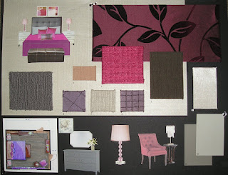
Since I didn't actually have a client to work with (and very limited time to complete my "package"for the interview) I used my own bedroom and redesigned it for the most part the way I would like it (though I've already changed my mind...it's hard designing for myself!).

Here's the board and display I created for the interview:


A close up of the board:


A close up of the bed perspective:


A close up of the floor plan (done in my DS's Crayola markers and pencil crayons - my Pantone markers are still missing...grrr):


A close up of the drapery fabric - LOVE IT!

Wednesday, April 15, 2009

Please Hold...

Hi everyone,

I'm applying for a government program which offers funding and business coaching to new businesses and so I'm going to be taking a small break from Blogland; about a week or so should do it. The application process is fairly involved and competitive and I need to devote my attentions to it. I have a few posts on the go, so there will be lots to read when I get back.

Wish me luck!

Sarah

Friday, April 10, 2009

Rules? Bah!

I've been toying with writing about decorating "rules" for a bit, but after reading House and Home's May issue, I decided to stop toying with the idea and get on it.

I often tell clients that there are no more rules when it comes to decorating, in response to their questions "Do people still do that?" or "Can I do that? Does it work?". We are at a point in interior design where anything goes. It's your house - if you like it, go for it! Be brave! Be bold!

Gone are the matchy-matchy days of the exact same pattern on the bedding, drapes and wallpaper, or the sofa/loveseat/chair set right off the showroom floor. It's too much. I can't handle it. Where's the creativity in it?

It's all about mixing and matching, and making your home reflect who you are and what you like. Now if you like a pattern so much as to put it on every available surface, all the power to you. I don't want to offend anyone here.

I'm a great believer in what I call" eyeballing". Not the most glamourous of design terms, but I think it's a pretty accurate one. Have you ever noticed that while following the "rules", like hanging your art with the center 60" from the floor or the bottom 8"-10" from the back of the sofa that it still doesn't look right?

That's where "eyeballing" comes in. Sometimes you just have to throw away your tape measure and eyeball it.

Same goes for fabrics - maybe the colours are a little off from one another, or not every colour in your palette is represented or you think you might have too many patterns - if it feels right to you, it is. Which is really the moral of the story here.

But wait! Back to House and Home, what really inspired me to get off my bum and start typing. The cover said exactly what I'd been thinking of for this post - Decorating Rules Worth Breaking. Here are a few examples:

Think Big With Lights

They say the "rule" for lighting a dining table is to find a light 12" smaller than your table and hang it 30"-36" above the table top.The "broken rule" says to find a shade as wide as the table and hang it 30"-32" above the top.

IMHO, the classic pic's light was WAY too small and high, but the updated pics was HUGE! Ridiculously so. Maybe just the angle of the shot.

Downsize Mouldings

Rule: wainscotting should be the lower third of the wall, up to at least 30". Update: make a super-fat baseboard/super small wainscotting 18"-20" from the floor.

Ok, what? It looks hor-awful! It makes the scale of everything look off. It was just weird.

If I'm going to divide up a wall, I like to do it just under half way, or up high as a plate rail. It does depend on the space though.

There was more, but you can see where I'd eyeball some of this stuff. I'm sure there are hardcore designers out there who would be wagging their fingers and tsk-ing at me, but Bah! to them. Design is passionate, emotional and personal. Sometimes the rules just don't apply.

I’m a Barbie Girl!

What woman doesn't have fond memories of her Barbies? I know I do (except a lot of my "Barbies" were actually Jem and the Holograms dolls). The endless hours of dress-up, soap opera story lines and of course for the design divas, the arranging and re-arranging of the furniture.

Good news! There's a new full-size Barbie Home Collection on the horizon!

BARBIElouisXVI


While perusing May's Chatelaine I came across a beautiful Louis XVI oval back side chair with a stylized Barbie on the back. Apparently the collection includes cushions, art, bedding, rugs and more, ranging in price from $40 to $2000. Sounds pretty reasonable!


Bad news! I can't figure out where to get it!

I tried Chatelaine’s Shopping Guide, but it doesn’t seem to be there.  I’ve Googled every combination of words I can think of only to end up looking at doll sized furniture.  My next step is to call Chatelaine, but since it’s Good Friday they’re not open…so we wait.

I did, however, come across Jonathan Adler Loves Barbie.  This “happy chic” American designer made Barbie’s Malibu Dream House a reality in time for her 50th birthday last month.  According to several sources, his Barbie home collection is set to hit US shelves in September 2009.  It must be all hush-hush as I can’t find a whole lot about it.  I’m also somewhat uncertain as to whose home these pieces are for…ours or Barbie’s.  The Louis XVI chair seems a little more elegant than Jonathan Adler’s style, which is bright, funky and a little kitschy. 

  originalbarbiehouse

 Barbie’s original cardboard home in 1960

 large_Barbie_dream-house

Barbie’s new 3500 sq.ft Malibu dream house designed by Jonathan Adler

 barbiebedroom

 So this is where Barbie and Ken…uh…nevermind 

Friday, April 3, 2009

Speaking of Sweet Things...

Although this isn't design related, (unless I'm going to turn this blog into a lifestyle blog a la Martha Stewart, though as my husband can attest, I am NO Martha Stewart!) I had to share this coffee cake recipe because it's so simple and so good!

It also makes your house smell fantastic and would be great to bake before an open house if you're selling.


QUICK COFFEE CAKE

1 cup sugar
1 3/4 cups flour
2 tsps. baking powder
4 tbsps. butter or margerine
1 egg, slightly beaten
1/2 cup milk
1tbsp. sugar mixed with
1 1/2 tsps. cinnamon, reserved
-Preheat oven to 375 degrees
-Butter an 8" sq. cake pan
-Mix sugar, flour and baking powder in a large mixing bowl
-Work in butter or marg. until mixture resembles coarse meal
-Add egg and milk and blend until you get a sticky batter
-Spoon into pan and smooth out
(it's very sticky, so don't worry about it being
really smooth - the lumpiness gives it character!)
-Sprinkle the sugar/cinnamon mixture evenly over top
-Bake for 20 minutes or until a knife comes out clean
(it took 30 minutes in my oven)
This coffee cake is great because it's quite plain, so you can dress it up by adding chopped nuts, fruit, chocolate, even some instant coffee! Get creative! My mum (who gave me this recipe) suggested doubling the sugar/cinnamon mixture and swirling half through the batter. Try it at home and let me know how it turned out!

Wednesday, April 1, 2009

A Big Slice of Cherry Pie

This is exactly what Ottawa needs more of - businesswomen working together to help each other out. Cherry Pie was a networking event for women that I attended last night and I'm really glad I went. It was a lot of fun and I met some really great women.

Cherry Pie was held at Lago Bar and Grill, a chic and contempory new restaurant, on Dow's Lake. It was basically run like a trade show with booths throughout the main dining area and offering everything from eco-friendly baby products to custom cupcakes to spray tanning.

Here is one of the
owners of Lago.... whose name I missed because of the noise. Sorry!

Some fellow businesswomen having a good time.

One of my favourite things was the Barter Wall. You could put up a huge neon sticky note with your services and what you were looking for. Mine said "I do: INTERIOR DECORATING I need: SURPRISE ME!" I thought it was a really neat way to let others know what you offer without having to introduce yourself to strangers. I guess that's what networking is all about, but it's just not my style.

Here I am with my good friend Jennifer Spallin. She's a CFP with Richardson Partners Financial Ltd. and your best bet if you're looking for sound financial advice. She's also a very cool chick, for someone who crunches numbers all day!
For more information about Cherry Pie see their website at: http://www.cherrypieottawa.com/

Sunday, March 22, 2009

Your Guide to Outdoor Furniture

Ok, so spring is almost here. Well, officially, it is here, but we're not quite ready to spend any significant amount of leisure time outside. Now is the perfect time, however, to think about what you're going to be perched upon during said leisure time. Here are a few of your options and their pros and cons:

Cast Aluminum: By far my favourite choice of them all. Cast aluminum is strong, beautiful and extremely low maintenance. These pieces can be left outside all year (yes, even during the winter, which is great if you're low on storage space), never rust, clean up with mild soap and water and can easily last you upwards of twenty years. There is a multitude of design, size and colour options to suit anyone's taste and needs. Cast aluminum is quite pricey, though. A high quality 5 piece set can run you $2500 and up. But it's such a great investment that it pays for itself. Something to remember: although cast aluminum can be left out all winter, once it's frozen into the snow don't touch it! Well, you can touch it, but don't try to move it, or stack anything onto it. Cast aluminum gets very brittle when it's cold.
All-Weather Wicker: This is a great product for those who love the look of wicker but know that natural wicker is not a great outdoor choice for our Canadian climate. Made of virgin vinyl, all-weather wicker is durable, fade-proof, comfortable and stylish. The name is a little misleading - the weave itself would be fine in all seasons, but the hollow aluminum frame means the pieces must come in during the winter. This is because if any moisture has accumulated inside the frame it can freeze, expand and crack the aluminum.Teak: Teak is such a beautiful and durable wood. A responsible teak dealer purchases plantation-grown Indonesian teak which is sustainable, and carefully controlled to avoid over-harvesting. Teak can be left out all year and is rot and insect resistant. There can be quite a bit of maintenance with teak. If you want to maintain the honey tones of the wood you need to apply a teak oil/sealer about once a year. You also need to lift the previous year's coat by sanding or with a teak cleaner. Failure to do so could cause a build up of the product and black mildew marks to form. If you do not treat your wood it will weather to a beautiful silver-gray. This does not affect the integrity of the wood at all and is only a surface change. Outdoor Fabrics: Most outdoor pieces now come with a wide variety of fabric choices for cushions and umbrellas. 100% acrylic is the best choice for it's fade, mildew and water-resistance. Look for fabrics that have the colour all the way through the fibres (looks the same on the front and back) rather than patterns that are printed only on one side of the fabric. Sunbrella is a widely recognized name in outdoor fabrics and many fabric companies put out fabrics under their own name, but use a Sunbrella base. The cushions should be brought in if you're going to be away for a few days or if it's going to rain, but a little shower is not a big deal. The foam used is meant to drain water quickly. Clean up is easy with a mild soap and the garden hose; just give them a little scrub and rinse the soap right through.
Pictures courtesy of Hauser Company Stores
1723 Carling Avenue, Ottawa
613-722-8795

Friday, March 13, 2009

Steven, Chris and Tracy

I read in a forum today that Steven and Chris has been cancelled. I admit I'm not that surprised. They were great as the Designer Guys (much better than the three now, who are a little dull, in my humble opinion), but their talk/lifestyle show never had the same appeal to me.
In the forum I also read that some viewers thought they should take over for Tracy Moore on Cityline. I then proceeded to look up Tracy Moore and found more forums and these ones were not kind to her at all. They were actually pretty rude. I was never a faithful Cityline viewer when Marilyn Dennis was the host, but not because there was anything wrong with her. I just didn't really relate to her. Now that I'm home with my daughter (13 mos. old and VERY cute...not that I'm biased) I have time to indulge in a little daytime TV. I think Tracy is a great host. She's young, stylish, energetic and fun. Which is what that show needs in a host. Fashion, decor, and food are fun - who wants a stodgy host!? Keep up the good work Tracy!
----------------------------------------------------------------------------------
APRIL 10/09 -- A few weeks ago I came across Tracy's blog Baby Steps, which I totally relate to, having a 14 month old daughter (and a 6 year old son, but he's a whole other story!). In her post about babies playing with everything but their toys, she asked readers to email her with a few of the things they use to occupy their little ones. So I did, and she added my list to her blog. Check it out! Toys. Who Need 'Em? Part 2

Wednesday, March 11, 2009

Colour Theory 101

Did you know that colour can affect your mood and behaviour? I'll bet you've heard it but don't really know how it works. Colour association and psychology can affect the way you feel, how you perceive others and how they perceive you, how you feel about a business; their image and logos, and how you behave in certain situations.


BLUE
Emotional: serene, peaceful, harmony, tranquility, airiness, melancholy, depression
Physical: can lower blood pressure, cools, relaxes, can slow respiratory rate
Behavioural: conservative, loyal, responsible, dependable, conservative, rigid


Blue is a colour that is often chosen for uniforms (police officers, public service) because it connotes dependability, authority, and reliability while being non-threatening.
It is preferred by most people as it invokes images of sea, sky and traquility (in softer hues).
Depresses the appetite and is a poor colour choice for restaurants.


GREEN

Emotional: balanced, secure, envy, detached
Physical: nourishing, nurturing, refreshing, rejuvenating
Behavioural: generous, moderate, inexperienced


Green is a poor business colour as it is associated with inexperience and personal gratification, though it continues to rise as a colour and term for environmentally friendly businesses.
Green invokes feelings of freshness, prosperity, and healing and is a great colour for bedrooms.


YELLOW
Emotional: radiant, cheerful, happiness, hope, nervous, anxious, irritable
Physical: can sharpen memory and stimulate intelligence, can increase irritability and agitation
Behavioural: people are said to be more argumentative in a yellow room


Though yellow is a joyous, happy colour, too much of it can cause anger or annoyance. Softer yellows, such as cream, butter, and bisque (hmm...all food names) are the best choice for interior spaces, while bolder choices, like lemon, gold and banana, are best for accessories or clothing. An intense yellow in a baby's room can cause sleep disturbances and irritability.


ORANGE
Emotional: lively, warm, inspirational, optimistic
Physical: decreases irritability and hostility
Behavioural: extroverted, sociable, friendly, cheap, gaudiness


Orange is a popular colour that appeals to many people as it is undemanding, fun, and is less intimidating than red. It can also be seen as cheap or inexpensive (Home Depot, anyone?).


RED
Emotional: passionate, exciting, hot, bold, volatile, intimidating
Physical: can increase blood pressure, respiratory and heart rate, adrenaline production
Behavioural: sensuous, courageous, aggressive, impulsive, overbearing


Red is a great colour for a dining room or in a restaurant as it increases your appetite. People who wear red are said to be confidant and want to stand out. Be careful using red in your home as it can make your walls visually advance and can cause a room to feel warmer than it really is.


VIOLET
Emotional: spiritual, imaginative, contemplative, lonely, melancholy
Physical: can lower blood pressure, can decrease appetite
Behavioural: creative, noble, philosophical, wealthy, isolated


Violet is a colour that is often associated with royalty because at one time, only the very wealthy could afford the dyes. Lower class people wore mainly brown and green.
Violet combines the power of red with the calming properties of blue, making it a popular colour choice.


PINK
Emotional: affectionate, romantic, feminine
Physical: weakens muscles, stimulates sweet cravings, calms and decreases stress
Behavioural: subdued, gentle, indulged


While pink will always be a go-to choice for babies and young girls, many adults would not choose this colour for their interior space.
Many prisons will paint the cells of dangerous offenders pink because of it's tranquilizing properties.


BROWN
Emotional: stable, sturdy, earthy, bored
Physical: dulls the senses, stimulates chocolate cravings
Behavioural: reliable, practical, casual


Associated with stability, dependability and reliability (UPS is a prime example). Not a great colour to wear to an interview as it makes one appear dull and lacking in authority. A great neutral in home decor that can be paired successfully with almost any other colour.


WHITE
Emotional: innocent, hopeful, pure, sterile, cold
Physical: no effect
Behavioural: idealistic, cleanliness, indecisiveness


An all white room is stressful because it reflects too much light. You can avoid this by using tone-on-tone whites and lots of texture to absorb some of the light.

BLACK
Emotional: aloof, mysterious, power, intimidating, fear
Physical: depresses
Behavioural: dignified, sophisticated, evil, rebellious


Black is a great multi-dimensional colour that can be used in traditional or contemporary interiors as it can be bold, graphic, elegant, classic and neutral. As we all know, wearing black makes you appear slimmer, but it is perceived that people who wear all black do not want others to invade their space.


GRAY
Emotional: resigned, steady, reliability, authority, gloomy, depressing, dull
Physical: no effect
Behavioural: discerning, mature, wisdom, humilty, boredom


Gray is a popular neutral for homes and fashion. Changing gray's undertones allow it to work in a multitude of palettes, providing relief from stronger colour choices. Gray is also a professional colour that is often used for uniforms and business suits.

Tuesday, March 10, 2009

Beauty on a Budget


This is a main floor I completed in November 2008. My client had a pretty tight budget, about $2000, but want her home to look elegant and cozy.

She had a few pieces she wanted to keep, like this Gibbard dining set (circa 1870-1900?) purchased in 1970 for $100. Yes, you read right - $100 for a 9 piece set. She's quite the bargain hunter! My client was also keeping her sofa. Though 12 years old, it was in great shape and in a neutral brown chenille. Not so hard to work with. A swivel rocker in blue also made the cut and was the basis for our accent colour.


We started with the wallpaper, a cream tone on tone botanical pattern, as the accent wall on the back wall of the dining room and the TV wall in the living room. I had a custom paint made to the background of the paper to ensure a perfect match.

We then purchased two units from IKEA; a bookcase and TV unit from the Markor series. With the clean, yet traditional lines and dark stained wood they were a great match for the Gibbard dining set.


Next came art and accessories. We purchased new drapery panels - a steal at $11 per panel. All new artwork and accessories came from Homesense, Canadian Tire, Bouclair, and Fabricland. We got some really interesting pieces at great prices. I also raided all her cupboards, closets and other rooms. You'd be surprised what a fresh perspective can do with the old knick-knacks we've all got stored away.


All in all, we came in under budget at around $1800. Not bad.

Monday, March 9, 2009

HRTC and You

In addition to decorating for private clients, I work Saturdays at Randall's Decorating Center in Bell's Corners and I've noticed that business is still strong and steady. It seems that people are not looking to sell or buy new properties, but are choosing instead to fix up the homes they have (though I did hear on the news earlier that now is the best time to buy a new construction home).


Here's where the new Home Renovation Tax Credit comes in: you can receive up to $1350 back on your tax return for the 2009 tax year. To be eligible, you must spend more than $1000 up to $10,000 on home improvement items that cannot be removed when you move ($9000 x 15% = $1350).

Here are a few examples from the Canada Revenue Agency's website:

-Renovating a kitchen, bathroom or basement
-New carpet or hardwood floors
-Building an addition, garage, deck, garden/storage shed, fence
-Re-shingling a roof
-A new furnace, woodstove, boiler, fireplace, water softener or water heater
-A new driveway or resurfacing a driveway
-Painting of interior or exterior of a house
-Window coverings directly attached to the window frame and whose removal would alter the nature of the dwelling
-Laying new sod
-Swimming Pools (Permanent - in ground and above ground)
-Fixtures – lights, fans, etc.
-Associated costs such as permits, professional services, equipment rentals and incidental expenses.


Notice the bold and italicized words above? Yes, it seems that the services of an Interior Decorator are eligible for the HRTC! I called Service Canada today to get more information, but because this is a new program, they didn't have all the info. I'll keep you posted!